Understanding Antialiasing and Transparency
A Tutorial
Introduction
When designing web pages, you will often wish to incorporate graphic elements. The easiest way to include graphics is through the use of images.
Images, though, have two fundamental limitations for supporting graphic elements. First, rather than being vector-based (as are text and graphics created in programs such as Illustrator), images are a collection of pixels. Second, images are always rectangular.
In order to make your graphics look as smooth and accurate as possible, and in order to seamlessly integrate them into your design, you will need to understand antialiasing, and how it relates to transparency. This tutorial will explain the basics of antialiasing, and how to use succesfully use it in tandem with transparency.
Aliasing
The term aliasing pertains to the process of sampling something smooth and continuous using a series of discrete measurements. If the measurements do not accurately represent the function, unwanted artifacts which are not present in the original will appear. The appearance of these artifacts is referred to as aliasing.
In our case, the smooth and continuous feature we are interested in is vector data, such as text or an illustration. The sampling that occurs is due to rasterization: the process of converting vector data into pixel data. The limitation of this representation is that while vector data can represent limitless shapes and has infinite resolution, pixels are square and are relatively large.
This limitation isn't visible when dealing with rectangular objects, as in the images below:

|

|
| Rectangular features, even when magnified (right) suffer from no visual artifacts. | |
As soon as we deviate from rectangular shapes, however, we begin to see some unwanted artifacts.
 |

|
| Diagonal lines are rendered less accurately. A magnified view demonstrates jaggies. | |
These unwanted artifacts, often called stairsteps or jaggies, are a form of aliasing. They'll appear whenever we attempt to represent a shape that deviates from a rectangle.
Antialiasing
As you have probably surmised, antialiasing (or sometimes, anti-aliasing) refers to methods of eliminating (or most often, reducing) these unwanted artifacts. In the context of rasterizing images, antialiasing refers to the reduction of the jagged borders between colors.
The example below demonstrates the most effective technique of antialiasing graphics: taking advantage of the many levels of color that our monitors can represent.
Here is a simple image that is still complex enough to show jaggies when rendered. This is even more noticeable in the detail image.
 |

|
| A large atmark rendered without antialiasing. | |
Here is the same image rendered using antialiasing. Note how much smoother this image appears, and how much better integrates into the background.
 |

|
| Antialiasing smoothes out the jaggies. | |
The detail image should demonstrate the basics of how antialiasing works with images. Rather than only using black and white pixels, intermediate levels of gray are used to blend the pixels together. The amount of black or white used represents how much the original graphic covers a pixel. A fully covered pixel will be black. One that is not covered at all will be white. One that is halfway-covered will be gray.
In this case the border pixels are shades of gray because the foreground is black and the background is white. If the foreground were red, however, the border pixels would be shades of pink.
 |

|
| With a red foreground and a white background, intermediate pixels are pink. | |
How to Use Antialiasing
Contrary to what some may believe, antialiasing is not a separate step of image processing. You cannot, for example, take a jaggy image and antialias it. Rather, it is an important part of rasterization, the process by which vector elements such as text and graphics are converted to images. Below is a dialog presented in Photoshop when importing a graphic created in Illustrator:
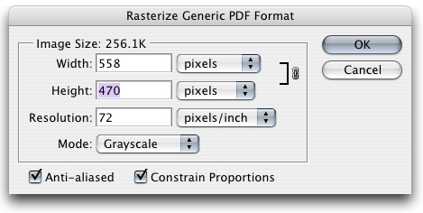
The Anti-aliasedcheckbox tells Photoshop that, when rasterizing the vector information into an image, it should use intermediate colors to ensure that the image is as smooth as possible. This is the default behavior in Photoshop.
You will get antialiased text when you create text directly in Photoshop. In fact, most modern programs that can antialias vector data will do so by default.
Transparency
The fact that image files are always rectangular can present some limitations in site design. It may be fine for pictures, but it is less desirable for logos, or for images that gradually fade into the background.
For relatively simple web pages (such as the one that you are reading now), this restriction is easily worked around: simply match the background of your image to the background of your web page. If you pick the exact same color (easiest if using pure white), the rectangular boundary of your image will be invisible. This simple technique has been utilized for many of the graphics on this page.
This technique is less successful if your background is more complex, however. If you use an image as a background, for example, you can't just match one color. And because different web browsers have slight differences in how they display web pages, it's basically impossible to try and match the background of your image to the background of your web page.
What you really want to do is specify that regions of your image are transparent. The table below simulates a web page with an image-based background. By tagging the white regions of our image as transparent, the background image of the web page shows through.
| |
|
| Using transparency lets the background show through. | |
Transparency with GIFs
The ability to tag a region as transparent is a feature of the GIF (89a) file format. With a GIF, you can tag that one of the 256 colors used in a graphic should be transparent and let the background through. In the image above, the white background has become transparent. And when placed on a relatively white background, it looks great.
Placing the image on a darker background, however, yields less successful results:
| |
|
| Switching the background on a transparent GIF. | |
When placed on a darker background, the image appears to be surrounded by white. This "halo" effect is a common mistake among web designers. Can you guess why it occurs? This detail image should make it clear:
| |
|
| The halo effect revealed. | |
When we were working with our graphic in Photoshop, we were doing so over a white background. Because we were antialiasing, the image was created with black foreground pixels, white background pixels, and many levels of gray in between. Remember that the GIF format allows for only one color to be specified as transparent. This has no effect on any of the intermediate gray pixels, which all show up as a halo.
To correctly handle transparency, you need to make sure that the intermediate colors created when antialiasing blend into your background color. When using Photoshop's "Save For Web" feature, you can achieve this by setting the Matte color to match the background color of your page. In this example, we've done just that:
| |
|
| Switching the Matte color to match the background color dramatically improves results. | |
This does mean that graphics created using the GIF format for transparency aren't very portable. The image produced for a blue background will look terrible on a white background, and vice versa. This is an unfortunate limitation of the format.
Transparency with PNGs
If you have any experience with computer graphics or with using Photoshop, you may be shaking your head at how limiting GIFs can be. In Photoshop, your vector graphics will often layer over backgrounds without any problems. This is because in Photoshop (as in many other image processing packages), each pixel has a level of opacity in addition to levels of red, green, and blue. The less opaque a pixel is, the more of the background will show through. This additional channel of information is often referred to as the alpha channel.
Files stored in Photoshop's native format (or in the universal TIFF format) can properly store opacity. These formats are not, however, suited for use in web pages: their lack of a lossy compression scheme results in files too large to be quickly transmitted.
The PNG image format, however, supports varying opacity and can compress images small enough so that they can be used on the web. In the example below, we've saved our image as a PNG. And, if all goes well, you should see the image properly layered over various backgrounds:
 |
|
|
|
| With PNG's support for varying opacity, the same image can work over a variety of backgrounds — as long as your browser supports it. | |||
Rather than storing intermediate colors and tagging one of them as transparent, each pixel is encoded with how much of the background to let through. Pixels with less opacity well let more of the background through.
As you can (hopefully) see, this is a much simpler way of working with web graphics, especially when working with a tool like Photoshop that already contains a notion of opacity. If these images don't look correct to you, you've discovered the main limitation of PNGs: unified support. Despite the fact that the PNG file format has been around for years and is seemingly perfect for the web, many browsers don't fully support it.
libpng.org maintains this highly-detailed page of browser compatibility. The good news is that most modern browsers (Mozilla, Firefox, Konqueror, Opera, Safari) do a fair job of supporting PNG. The bad news is that Internet Explorer is not one of them.
 |
| A screenshot of the above demonstration, in case you are using a browser that doesn't fully support PNG. |
Photoshop CS has native support for PNG. Creating one is as simple as Saving in the PNG format: opacity information will automatically be saved. More details about PNG and Photoshop support (including support in versions prior to CS) can be found in this excellent tutorial.
Transparency with JPEGs
At this point, you may be wondering what kind of support for transparency is in the JPEG file format. That's easy: none.
Related Issues
You may have realized that antialiased vector data isn't the only place where intermediate colors come into play. Effects like blurs and drop shadows also rely on blending into the background.
Though the effect is different, the principle is the same: when creating your graphics, keep in mind what the background of your web page will be. The images below demonstrate a drop shadow effect: first with a poor result, then with an effective result.
 |
 |
| Successfully incorporating blending effects such as a drop shadow require the same techniques. | |
Conclusion
Antialiasing and transparency are two tools that depend upon each other to get good results. Now that you know how they work, use them together to make quality, professional designs.
Good luck!